
SportSync
SportSync is a mobile app designed to help people find and join local pick-up games or connect with others who share the same sports interests. Whether you're new to a city, looking to stay active, or just want to meet fellow enthusiasts, SportSync makes it easy to find your next game.
Project Overview
Project length: 5-7 days
Tools used: Google Forms, Figma, Maze
My Role
I led the end-to-end design process including:
-
User research and persona development
-
Experience mapping and wire-framing
-
UI design and interactive prototyping
-
Usability testing and iteration
Discover
The Problem
People often struggle to find others to play sports with, especially if they’re new to an area or their usual group isn't available. Social platforms aren’t tailored for sports matchmaking, and existing solutions lack structure, reliability, or community engagement.
Research
User Interviews & Surveys
We Interviewed 10+ users ranging from recreational players to amateur athletes. Top needs that were identified are:
-
A way to join spontaneous games nearby
-
Filter by sport, location, skill level, and time
-
Ratings/reviews of players or game hosts
-
Easy group messaging and RSVP features
Competitive Analysis
We desided to explore Meetup, Facebook Events, and TeamSnap. While helpful, these lacked spontaneity, personalization, and a sports-specific experience.

The feature comparison chart is a tool that allows us to compare our app’s features side-by-side with its competitors. This helped us identify any trends and openings in the market more easily.
Identifying mental models helped us understand what users expect to see in a pick-up sport app so that our solution would resemble features that users have seen before, thus allowing it to feel more intuitive and easy to navigate.
Key Pain Points
-
Difficulty finding pick-up games or sports groups nearby
-
Lack of reliable platforms for sport-specific networking
-
Fragmented communication (text threads, social media, offline planning)
-
Intimidation for newcomers or casual players
Define
User Persona

Raj, 29 – New to the city, works remotely, loves soccer.
"After work, I want to find a quick pickup game nearby — but I don’t know anyone here or where people play."
Affinity map
An Affinity map is a tool that allows designers to structure the data from their qualitative research and find underlying themes and trends from their users.

The most common theme observed from this affinity map is the difficulty of finding and organizing casual sports games without an existing network. Users consistently expressed pain points about not knowing where to find players, struggling with disorganized communication channels, and lacking a dedicated platform — which directly connects to the key opportunity of creating a centralized, easy-to-use app for game discovery, coordination, and community building.
This map provides a lot of insight when organizing our data and finding our direction for out problem statement.
Value Proposition Chart
A value proposition chart helps designers clearly identify measurable and demonstrable benefits users receive when using a product or service.
Creating this chart based on our data helped us understand ways we can add value to our users’ experience on this app according to their goals, motivations, and jobs they need to get done.
We are also empathizing with the user’s highs and lows so we can consider the psychology behind their behavior.

As-is-Scenario and User Journey Map
The as-is scenario map is a tool that helps us find hidden user pain points and frustrations that we might have left out in our process.
Most of the users we interviewed used this app for the purpose of finding more like-minded people to play the sport with and discover new circles so we follow their journey from the beginning to end to identify our key problem we are trying to solve with this product.
The value-proposition map and user journey map taps into our users’ psychology and provides insight on WHY these were their biggest pain points by looking more closely at emotions and thoughts.


Problem Statement
From our journey map, we defined three clear problems that our user faces when tries to complete the actions in their user journey
1. Our user is agitated because the games they picked up are being cancelled last minute and they are not aware of it until they reach the venue.
2. Our user is unsure and confused about the app being active and relevant in their area.
3. Our user is anxious and full of dread about having to keep track of the game dates, timing and skill level within the group.
People who enjoy playing sports casually often lack the tools to find and organize games with others in their area. This leads to missed opportunities for social connection, physical activity, and community building.
From these three problem statements, we also created the goals that would help us think of ways we could solve these problems.
The Goal
To design an intuitive, inclusive platform where users can:
-
Discover local games or sports events based on skill level and location
-
Create and manage their own games or sports groups
-
Connect with like-minded players easily
-
Encourage community-building around fitness and recreation
Develop
Ideation & Strategy
SportSync was built around three design pillars:
-
Accessibility: Easy for anyone to sign up, browse, and join games
-
Matchmaking: Smart filters to match users by sport, location, and level
-
Community: Profiles, reviews, and messaging to build trust and repeat interactions
-
Design Process
We used a tool called the MoSCoW method to group each of our feature ideas from most essential to least essential, based on our data and the problems we found that our users were experiencing.
We took every idea from our brainstorm and placed them into one of four categories: Must-have, Should-have, Could-have, and Won’t-have. This process helped ensure that we only focused on the most essential features that would solve our problems directly.

After narrowing down our must-have features, we returned to our value proposition canvas to ensure there was a strong product-market fit.
Minimum Viable Product
An MVP is a product which solves users’ frustrations and adds value to their experience with the minimum amount of features. The MVP is important in order to create features that are essential to solving the problem, rather than for fun design or innovation.
SportSync's MVP answers the single core user need:
“I want to quickly find and join a local sports game with people like me.”
To clearly define that we narrowed down to a few MVP features for SportSync:
-
User Onboarding
Simple sign-up/login (email, Google, Apple, etc.)
Basic profile setup (name, preferred sports, skill level, location)
-
Game Discovery
Browse games by sport, date, and location
"Games Near Me" (basic location-based filtering)
-
Join/Create Games
RSVP to existing games
Create a new game (time, location, required players)
-
Notifications & Updates
Push notifications for RSVP confirmation and game reminders
Cancellation alerts if a game is dropped
-
Communication
In-app group chat for each game to coordinate details
Why These Are the MVP Core?
Without these, SportSync cannot deliver on its promise: helping people find and join local games easily.
All other features (friends, skill tags, waitlists, social badges, ratings) are “should-have” or “could-have” and can come later after user adoption.
This takes us to the next step of how would the user use our product? For which we used the following sequence:
User Flows
A user flow chart is a tool that maps out paths our users will take when navigating through our product to achieve a certain goal. This process involves organizing information architecture, where we strategize how to display and structure each piece of information within our product. Following are some of the steps that we came up with.
-
Join a public game
-
Discover → Filters → Game Details → RSVP → Confirmation → Chat → Reminder
-
-
Host a game
-
Create → Publish → Manage RSVPs → Message all → Reminder → Complete → Re-host
-
-
Communicate
-
My Games → Game → Chat (attach location pin, quick messages)
-
-
Retain
-
Notifications: “New games near you at 6–8pm” / “Spots open in your saved sport”
-


Wireframes to Prototype
Low-Fidelity Wireframes
We sketched out low-fidelity wireframes to explore layout and navigation patterns, focusing on keeping flows minimal and intuitive
and tested it with 7 people. We also used this conceptual heat map to indicate where we expect attention/clicks to go.
This type of visual representation and data can help us identify popular elements, pinpoint areas of user frustration (like "rage clicks" on broken buttons), and understand which content users are missing, thereby optimizing the user experience to improve conversions.
This map confirmed that our users knew where to click, although this data was slightly corrupted.
7 Testers
Average Duration: 50 secs
Misclick rate:
20%

80% Success rate
"Found it simple and intuitive"
"Some layout was just like the other apps I've used "
"Wish some buttons were more obvious"

Mid-Fidelity Prototype
The next step was to make changes according to user feedback in our lo-fi prototypes. Our product was kept simple, intuitive and something that is built on a familiar mental-model to reduce the cognitive load.
When the interface matches what users already expect, they don't have to pause and figure things out. Familiar UI patterns (like a shopping cart icon for checkout, or a magnifying glass for search) instantly communicate purpose and reusing conventions leverages prior knowledge, saving time and reducing mistakes.

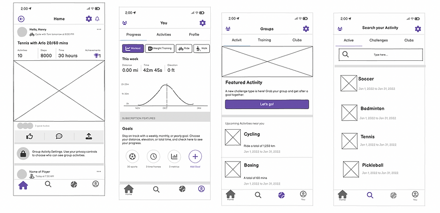
Our usability metrics were overall higher than when we previously tested during the low-fidelity phase. There was a 100% success rate and a 91 usability score. After we made minor changes based on our user data, we finally got to designing our hi-fi prototype.
High-Fidelity Design
The SportSync Design System was created to establish a consistent, vibrant, and approachable identity for the app. Each design component was developed with the brand’s core values — community, energy, and inclusivity — at the forefront. The design language is clean, dynamic, and human-centered, ensuring users feel confident and connected every time they interact with the app.
The SportSync identity represents connection and motion — bringing people together through shared sports experiences. The clean wordmark and energetic color choices evoke a sense of movement and excitement, while maintaining a modern, trustworthy tone suitable for a digital community platform.
Imagery & Tone
SportSync’s imagery celebrates real people, real sports, and real connection. The use of authentic photography highlights diversity, teamwork, and fun — helping users emotionally connect to the brand.
Images are bright, natural, and energetic, reinforcing the feeling of motion and inclusivity central to SportSync’s mission.
Tone of Voice
The brand voice is friendly, supportive, and encouraging, speaking to users like a teammate rather than a company.
It motivates users with positivity — “You’ve synced with 3 new players this week!” — while avoiding overly technical or robotic language. The goal is to make users feel part of a welcoming, active community.
UI Components
Each UI element is designed to encourage effortless interaction and visual consistency:
-
Primary Buttons use the brand purple for clear calls-to-action.
-
Secondary Buttons and outlined variations maintain accessibility and hierarchy.
-
Cards use rounded corners and soft shadows to organize content in a familiar, tactile way.
-
Input Fields feature high contrast and generous spacing for quick form completion on mobile devices.
These elements were tested for both usability and aesthetic alignment, ensuring a seamless experience across various use cases.

Color Palette
The color palette embodies the spirit of activity and inclusivity.Together, these colors create a strong visual balance that feels active yet approachable — mirroring the collaborative essence of sports.

Typography
The Inter typeface was selected for its rounded geometry and modern versatility. It communicates friendliness and clarity while maintaining a professional look.
-
Bold weights establish hierarchy and confidence in headings.
-
Regular and medium weights ensure legibility across mobile screens.
-
Consistent typography enhances accessibility and harmony throughout the interface.

This design system not only defines SportSync’s visual identity but also supports its core purpose — building genuine human connections through sports. The cohesive use of color, typography, and component design creates an interface that feels energetic, inclusive, and easy to use, helping users go from browsing to playing seamlessly.
Keeping the above components in mind we focused on some key features like:
-
Game Discovery Feed: Filter by sport, date, time, and location
-
Profile System: Create a personal or team profile with badges and stats
-
Game Hosting: Create games and manage invites, RSVPs, and locations
-
In-App Messaging: One-on-one or group chats tied to each event
-
Reputation & Trust: Ratings for players and hosts based on reliability and sportsmanship
Usability Testing
The goal of usability testing for SportSync was to evaluate how intuitively users could discover, join, and host sports games within the app. I wanted to validate whether the navigation structure, visual hierarchy, and interaction patterns effectively supported user goals such as finding a local game or connecting with other players.
Testing Method
I conducted remote moderated usability testing sessions with seven participants representing SportSync’s target audience — individuals aged 18–40 who regularly participate in recreational sports or fitness activities.
Tools Used: Figma prototype + Zoom screen sharing
Test Type: Task-based testing
Duration: 30–40 minutes per participant
Devices: Mobile (iOS & Android)
Each participant was given 4 core tasks to complete:
-
Discover a local pick-up game and join it.
-
Create and host a new game.
-
Message other players within a game.
-
Customize their player profile and filter preference.
Key Observations
Overall, users found the design simple, friendly, and easy to navigate. The onboarding flow helped them understand the app’s purpose quickly, and most participants were able to complete their tasks without much help.
They especially liked the clean layout, the use of sports icons to find games quickly, and how easy it was to create or join a game.
Positive Feedback
-
Ease of Navigation: Users described the interface as “clean and straightforward.” Most completed their tasks with minimal guidance.
-
Visual Hierarchy: The color-coded sports icons and clear typography helped users identify relevant games quickly.
-
Game Creation Flow: The step-by-step format for hosting a game was well-received, reducing cognitive load and decision fatigue.
Pain Points
-
Too many steps to join a game: Some users felt joining took a bit too long. I simplified the process so it could be done in fewer taps.
-
Profile setup skipped: Several users skipped adding details to their profile. I added a quick reminder showing how it helps match them with better games.
-
Button labels confusing: Some buttons weren’t clear to new users. I replaced vague labels like “Sync” with simple, action-based terms like “Join Game.”
Iterations Based on Feedback
After testing, I made a few quick updates to improve usability:
-
Reduced the number of steps to join a game
-
Added short reminders during profile setup
-
Updated button labels for better clarity
-
Improved color contrast and spacing for readability
Results
After these changes, I conducted a smaller follow-up test and saw major improvements:
Task success rate: Increased from 78% → 96%
Average completion time: Reduced by 30%
User satisfaction: Rated 4.7/5 for clarity and ease of use
Participants shared comments like:
“It feels simple — I can find a game in seconds.”
“I like that it looks clean and friendly, not complicated.”
Key Takeaways
-
Small design details make a big difference in how confident users feel.
-
Simple wording and fewer steps lead to smoother, faster interactions.
-
Testing early helped me catch small issues before they became major usability problems.
Future Learnings
For future testing, I plan to include a wider range of participants — including less tech-savvy users — to explore accessibility and inclusivity in greater depth. I also want to test in real-world settings, such as sports venues, to understand how context affects user behavior. This will help refine SportSync’s design to be more flexible and user-centered across different environments.